CHAPTER 10 - Polymer Components (deprecated)
Polymer components were announced to close, and this turtorial will not be suggested to read, see official website's blog.
In the development process, UI design usually takes over half of the development time. Therefore, we will introduce the Polymer components supported by EZoApp in the last few days. Polymer components can make the interface richer and visually more appealing. However, since Polymer only supports the newest Android OS (4.3 or 4.4 and above), you should be cautious when using it.
There are more than 14 components available on Polymer's official website (https://www.polymer-project.org/docs/elements/). In the near future, EZoApp will also gradually integrate these components.
Right now, EZoApp includes the following components:
| paper-tabs | core-toolbar | core-scaffold | core-list | paper-menu-button |
| paper-button | paper-input | paper-checkbox | paper-radio-group | paper-toggle-button |
| paper-item | paper-slider | paper-fab | paper-icon-button |
1. paper-tabs

( Example: http://jqmdesigner.appspot.com/designer.html#&ref=4802825842327552 )
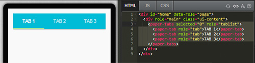
Similar to navtab, this is a set of buttons. When clicked, it will display the ripple effect of Material Design. The code is easy to understand as well. It contains a paper-tab, which further contains several paper-tabs; similar to how an ul contains several li. You can set a "select" attribute; 0 represents the first one, 1 represents the second one, and so forth.
<paper-tabs role="tablist" selected="2">
  <paper-tab role="tab">TAB 1</paper-tab>
  <paper-tab role="tab">TAB 2</paper-tab>
  <paper-tab role="tab">TAB 3</paper-tab>
</paper-tabs>
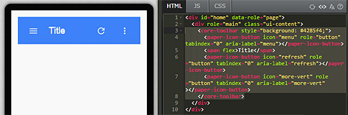
2. core-toolbar

( Example: http://jqmdesigner.appspot.com/designer.html#&ref=4820289716224000 )
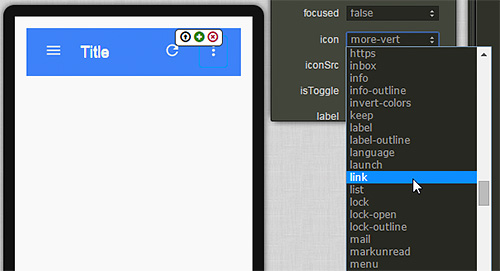
Adding this component onto the design screen is like creating a header with a tool bar; hence, the name "-toolbar". Clicking the buttons also generates a ripple effect, which looks quite interesting. In addition, Polymer also provides many icons to be used for the buttons; you can select the icons in the property panel.
<core-toolbar style="background: #4285f4;">
  <paper-icon-button icon="menu" role="button" tabindex="0" aria-label="menu"></paper-icon-button>
  <span flex>Title</span>
  <paper-icon-button icon="refresh" role="button" tabindex="0" aria-label="refresh"></paper-icon-button>
  <paper-icon-button icon="more-vert" role="button" tabindex="0" aria-label="more-vert"></paper-icon-button>
</core-toolbar>
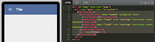
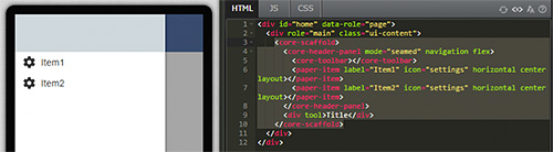
3. core-scaffold

( Example: http://jqmdesigner.appspot.com/designer.html#&ref=4900724521566208 )
Remember EZoApp's hidden component- slide panel? The core-scaffold component provides a menu that opens from the left when clicked. Unlike slide panel, which requires manual coding, core-scaffold just needs to be dragged-and-dropped onto the screen! What's special about this component is that it sort of provides us with a template; we can create header, slide panel, content, and others just by editing it directly.
<core-scaffold>
  <core-header-panel mode="seamed" navigation flex>
    <core-toolbar></core-toolbar>
    <paper-item label="Item1" icon="settings" horizontal center layout></paper-item>
    <paper-item label="Item2" icon="settings" horizontal center layout></paper-item>
  </core-header-panel>
  <div tool>Title</div>
</core-scaffold>
4. core-list

( Example: http://jqmdesigner.appspot.com/designer.html#&ref=5375970169061376 )
As the name suggests, core-list is a list component. However, this list adds the ripple effect (Material Design beats the competition with this effect!). Furthermore, EZoApp's core-list can link to JSON data because it has the "{{ }}" symbol! You can see in the JS code that it consumes JSON files.
HTML:
<core-scaffold>
  <core-header-panel mode="seamed" navigation flex>
    <core-toolbar></core-toolbar>
    <paper-item label="Item1" icon="settings" horizontal center layout></paper-item>
    <paper-item label="Item2" icon="settings" horizontal center layout></paper-item>
  </core-header-panel>
  <div tool>Title</div>
</core-scaffold>
javascript:
$(document).on("polymer-ready", function () {
  list.data = [{
    name: "aaahfyyw",
    time: "8:29 pm",
    details: "PARKOUR!"
  }, {
    name: "aaam",
    time: "8:29 pm",
    details: "Neque porro quisquam est qui dolorem ipsum quia dolor sit amet, consectetur, adipisci velit..."
  }, {
    name: "aabkch",
    time: "8:29 pm",
    details: "Lorem Ipsum is simply dummy text of the printing and typesetting industry."
  }, {
    name: "aacdfqrp",
    time: "8:29 pm",
    details: "PARKOUR!"
  }];
});
CSS:
core-list {
  height: 100%;
}
core-list .item {
  box-sizing: border-box;
  height: 80px;
  border-bottom: 1px solid #ddd;
  padding: 4px;
  cursor: default;
  background-color: white;
  overflow: hidden;
}

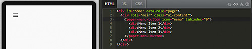
5. paper-menu-button

( Example: http://jqmdesigner.appspot.com/designer.html#&ref=4769317581225984 )
This is a simple button component for a menu. Click the button and it brings up a list menu.
<paper-menu-button icon="menu" tabindex="0">
  <div>Menu Item 1</div>
  <div>Menu Item 2</div>
  <div>Menu Item 3</div>
</paper-menu-button>
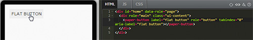
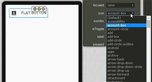
6. paper-button

( Example: http://jqmdesigner.appspot.com/designer.html#&ref=5928725749170176 )
This is a button component with the Material Design style. You can select icons using the icon option in the property panel; they also have a ripple effect!
<paper-button label="flat button" role="button" tabindex="0" aria-label="flat button" class="paper-shadow-animate-z-1-z-2" icon="account-box"></paper-button>
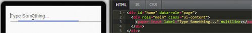
7. paper-input

( Example: http://jqmdesigner.appspot.com/designer.html#&ref=5969132398837760 )
This is an input component with the Material Design style. It generates a very cool ripple effect when clicked, which cannot be done with an ordinary input!
<paper-input label="Type Something..." multiline></paper-input>
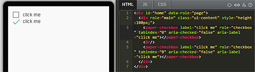
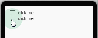
8. paper-checkbox

( Example: http://jqmdesigner.appspot.com/designer.html#&ref=6315822158970880 )
As the name suggests, this is a checkbox. However, because it is created by the Paper Elements of Polymer (refer to: https://www.polymer-project.org/docs/elements/), its effect naturally goes without saying. In addition to the ripple effect, its color and animation are very good as well. When clicked, the square selection box will change to a check mark through animation.
<paper-checkbox label="click me" role="checkbox" tabindex="0" aria-checked="false" aria-label="click me"></paper-checkbox>
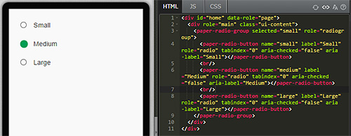
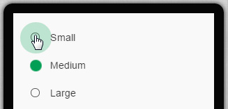
9. paper-radio-group

( Example: http://jqmdesigner.appspot.com/designer.html#&ref=6522732074237952 )
This is a radio button, which is like a cousin of the checkbox. However, it is actually a group of radio buttons. After all, unlike a checkbox, a radio button is a single-choice button, and you cannot have just one choice (otherwise, you can just use a checkbox). Therefore, this is actually a radio button group that includes several radio buttons. When clicked, it also displays nice color and ripple effects.
<paper-radio-group selected="small" role="radiogroup">
  <paper-radio-button name="small" label="Small" role="radio" tabindex="0" aria-checked="false" aria-label="Small"></paper-radio-button>
  <paper-radio-button name="medium" label="Medium" role="radio" tabindex="0" aria-checked="false" aria-label="Medium"></paper-radio-button>
  <paper-radio-button name="large" label="Large" role="radio" tabindex="0" aria-checked="false" aria-label="Large"></paper-radio-button>
</paper-radio-group>
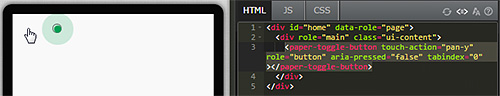
10. paper-toggle-button

( Example: http://jqmdesigner.appspot.com/designer.html#&ref=6026624428408832 )
This component is basically a switch component. It could also be viewed as a flipswitch component. However, since it is a Paper Element of Polymer, its overall look is more appealing.
<paper-toggle-button touch-action="pan-y" role="button" aria-pressed="false" tabindex="0"></paper-toggle-button>
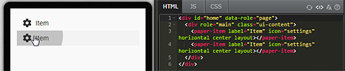
11. paper-item

( Example: http://jqmdesigner.appspot.com/designer.html#&ref=5852167420248064 )
This is a component that is kind of like a list. Its icons can be changed by using the property panel. The icons all carry the Material Design style.
<paper-item label="Item" icon="settings" horizontal center layout></paper-item>
<paper-item label="Item" icon="settings" horizontal center layout></paper-item>
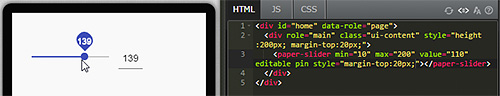
12. paper-slider

( Example: http://jqmdesigner.appspot.com/designer.html#&ref=5332267534647296 )
This is a cool slide bar component. In addition to gorgeous clicking and dragging effects, you can also set your own intervals to automatically create grid points. You can also set the pin to true to generate a bubble containing the slider value when sliding.
<paper-slider min="10" max="200" value="110" editable></paper-slider>
13. paper-fab

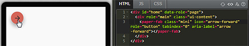
( Example: http://jqmdesigner.appspot.com/designer.html#&ref=5463674474987520 )
paper-fab is a button that floats on the screen. Usually, this is the button that has the main function. For example, the '+' sign in a contact list or the add new document function in Google Drive.
<paper-fab class="mini" icon="arrow-forward" role="button" tabindex="0" aria-label="arrow-forward"></paper-fab>
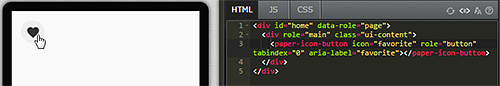
14. paper-icon-button

( Example: http://jqmdesigner.appspot.com/designer.html#&ref=4908447275417600 )
As its name suggests, it uses the Material Design style icon to create a button.
<paper-icon-button icon="favorite" role="button" tabindex="0" aria-label="favorite"></paper-icon-button>
Continue reading CHAPTER 11 - Interesting Custom-made Components
Or Return to Table of Contents