CHAPTER 4 - jQuery Mobile Components
Before introducing jQuery Mobile components (hereinafter called JQM components), we must first talk about jQuery Mobile. jQuery Mobile is a jQuery framework primarily used to build mobile webpages. Its current version is 1.4.5. Compared to earlier versions, version 1.4 made many modifications to the original architecture, thus greatly improving its speed.
When used simply to develop mobile webpages or apps mainly running in web view, jQuery Mobile is a very convenient and easy to use framework. EZoApp has native support for jQuery Mobile built-in, making JQM components must-haves. Furthermore, because EZoApp uses standard development syntax, if we cannot find a component in the built-in library, we can look for it on jQuery Mobile’s official website (http://demos.jquerymobile.com/1.4.5/) and create it by copying and pasting the code. This is very convenient!
In the next few sections, we will introduce all of EZoApp’s components starting with JQM components. After learning how to use components, you will soon be able to start developing standard interfaces (there will be more on how to write the code later)!
EZoApp JQM component table (click to see details):
1. header

Example: http://jqmdesigner.appspot.com/designer.html#&ref=5010871373791232
<div data-role="header" data-position="fixed">
  <h3>Header</h3>
</div>
This is the file header on top of every page. In an app, you will usually put the title of the page here or frequently used buttons at both the left and right sides. In EZoApp, you can click on the text of the header to edit it or use the property panel to make corresponding changes.

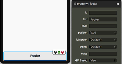
2. footer

Example: http://jqmdesigner.appspot.com/designer.html#&ref=6136771280633856
<div data-role="footer" data-position="fixed">
  <h3>Footer</h3>
</div>
footer is similar to header. It is also an essential part of the app's screen. You can also click on the text to make changes or use the property panel to make corresponding modifications.
3. Grid

Example: http://jqmdesigner.appspot.com/designer.html#&ref=5941219272163328
<div class="ui-grid-b" style="height:95px">
  <div class="ui-block-a" style="height:100%"></div>
  <div class="ui-block-b" style="height:100%"></div>
  <div class="ui-block-c" style="height:100%"></div>
</div>
This is the most important of the JQM components. It looks like a table, but it is not. It uses div+class to generate a frame similar to a table. Note that the number of fields is defined by a, b, c, d, e. An outer frame of ui-grid-a means it contains two fields of ui-block-a and ui-block-b. An outer frame of ui-grid-d means it contains five fields of a, b, c, d, and e. Each row can have up to five fields. If there are more than five fields, they will be arranged as two fields in a row.
<div class="ui-grid-d" style="height:95px">
  <div class="ui-block-a" style="height:100%"></div>
  <div class="ui-block-b" style="height:100%"></div>
  <div class="ui-block-c" style="height:100%"></div>
  <div class="ui-block-d" style="height:100%"></div>
  <div class="ui-block-e" style="height:100%"></div>
</div>

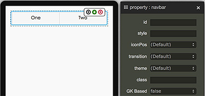
4. navbar

Example: http://jqmdesigner.appspot.com/designer.html#&ref=5993873960599552
<div data-role="navbar">
  <ul>
    <li>
      <a>One</a>
    </li>
    <li>
      <a>Two</a>
    </li>
  </ul>
</div>
This is the commonly seen button menu in an app. It is mainly constructed by li. In EZoApp you can also directly click on the text to edit it or use the property panel to make modifications. Similar to grid, there cannot be more than five buttons. If there are more than five buttons, they will be arranged as two in a row.
5. tabbar
Example: http://jqmdesigner.appspot.com/designer.html#&ref=5573821327212544
<div data-position="fixed" data-role="footer">
  <div data-role="navbar">
    <ul>
      <li>
        <a data-icon="home">BtnA</a>
      </li>
      <li>
        <a data-icon="star">BtnB</a>
      </li>
    </ul>
  </div>
</div>
This is a bottom menu that combines footer and navbar. This type of menu is also frequently seen in apps. Its control method is also the same as navbar and footer.

6. gk-text

Example: http://jqmdesigner.appspot.com/designer.html#&ref=6596240439508992
<h1 is="gk-text">Text</h1>
This is a text component. In EZoApp, you can also directly click on the text to edit it or use the property panel to make modifications.

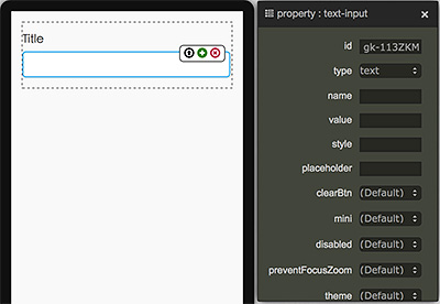
7. text-input

Example: http://jqmdesigner.appspot.com/designer.html#&ref=6025110184001536
<div class="ui-field-contain">
  <label for="gk-113ZKMM">Title</label>
  <input type="text" name id="gk-113ZKMM">
</div>
This is a simple text input box, except that it also includes some CSS effects. If you do not need the outer label, you can simple remove it or even directly use the mouse to click-and-drag the input box outside. You can use the property panel to adjust the settings of the input box. For example, you can set the clearBtn to true so that an x will appear at the end of the input; clicking the x will delete the input.
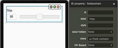
8. range-input

Example: http://jqmdesigner.appspot.com/designer.html#&ref=6604113651433472
<div class="ui-field-contain">
  <label for="gk-1138IX0">Title</label>
  <input id="gk-1138IX0" value="50" min="0" max="100" type="range">
</div>
This is a slider bar for adjusting a value. Because adjusting a value on a cell phone or tablet is not as convenient as on a computer, we often need to use this kind of easy-to-adjust component. This is a JQM component and you can use the property panel to set its maximum, minimum, and initial values, as well as the sliding interval, the highlighting color of the left side of the slider bar, and so on.
9. search-input

Example: http://jqmdesigner.appspot.com/designer.html#&ref=6519575004839936
<div class="ui-field-contain">
  <label for="gk-113fglk">Title</label>
  <input type="search" name id="gk-113fglk">
</div>
This is the input field of the search box. Basically, it is almost identical to the text-input. The difference is that it has a search icon in front of it. In addition, its type is search, instead of text, number, or password.

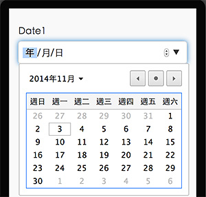
10. date-input

Example: http://jqmdesigner.appspot.com/designer.html#&ref=5285372128919552
<div class="ui-field-contain">
  <label for="gk-113BeiH">Date1</label>
  <input id="gk-113BeiH" type="date">
</div>
This is the date input component. Do not underestimate this component or think that it looks just like the input components mentioned earlier (however, it is actually quite like the previous input components; the only difference is that its type is "date"). If we preview it on the computer or on a cell phone, we realize that it can call out a calendar or a scroll-through calendar on a cellphone. It is very convenient!
11. time-input

Example: http://jqmdesigner.appspot.com/designer.html#&ref=5462160230580224
<div class="ui-field-contain">
  <label for="gk-113WHfb">Date1</label>
  <input id="gk-113WHfb" type="time">
</div>
Similar to date-input, this is a component that allows users to adjust time directly rather than enter it manually.

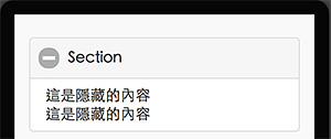
12. collapsibleset

Example: http://jqmdesigner.appspot.com/designer.html#&ref=5430924007178240
<div data-role="collapsibleset">
  <div data-role="collapsible">
    <h3>Section</h3>
    Hidden contents here
    Hidden contents here
  </div>
</div>
This component can keep part of the contents of the page hidden. Click the '+' sign to open it; click the '-' to close it.
13. icon

Example: http://jqmdesigner.appspot.com/designer.html#&ref=5940879567093760
<div is="icon" style="width:85px; height:90px; position:relative">
  <span class="ui-li-count" style="position:absolute; display:none; z-index:1; right:0; top:6px;"></span>
  <a href="#" class="ui-btn ui-mini ui-corner-all ui-shadow" style="display:block;margin:5px;height:50%;background-image: url(image url); background-size: 95% 80%; background-position: 50% 50%; background-repeat: no-repeat no-repeat;"></a>
  <div style="text-align:center;">Icon</div>
</div>
This component uses a method similar to the background image in CSS to create clickable images in the app.

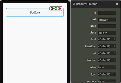
14. button

Example: http://jqmdesigner.appspot.com/designer.html#&ref=5891616426426368
<a class="ui-btn">Button</a>
You can see from the code that a button is actually a hyperlink with the added ui-btn style. Therefore, you can modify the style yourself and create customized buttons.
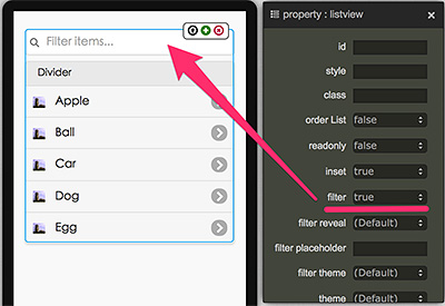
15. listview

Example: http://jqmdesigner.appspot.com/designer.html#&ref=4833352993472512
<ul data-role="listview" data-inset="true">
  <li data-role="list-divider">Divider</li>
  <li>
    <a href="#">
      <img src="image url" class="ui-li-icon">Item
    </a>
  </li>
</ul>
Although the JQM component of listview is basically a list, it has already separated the title from the contents for us. Furthermore, it also provides a filter function. If the list contains a lot of items, typing the search text in the filter's search box can screen out specific contents! This is very convenient!
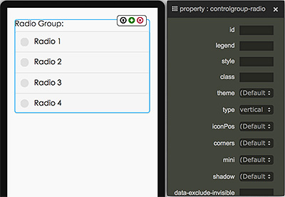
16. controlgroup-radio

Example: http://jqmdesigner.appspot.com/designer.html#&ref=5816401080090624
<fieldset data-role="controlgroup" data-type="vertical">
  <legend>Radio Group:</legend>
  <input id="gk-104dlEd" name="gk-104dlEd" type="radio" data-iconpos="left">
  <label for="gk-104dlEd">Radio</label>
</fieldset>
This is a (single-choice) radio button. You can use the '+' sign on the upper-right corner of the choice item to add new choices. When you add a new choice, its name will be generated automatically. However, if two options have different names, the single-choice will not work. All you have to do is to change the names so they are all the same!
<fieldset data-role="controlgroup" data-type="vertical">
  <legend>Radio Group:</legend>
  <input id="gk-104dlEd" name="aa" type="radio" data-iconpos="left">
  <label for="gk-104dlEd">Radio1</label>
  <input id="gk-104PBuC" name="aa" type="radio" data-iconpos="left">
  <label for="gk-104PBuC">Radio2</label>
</fieldset>
As a JQM component, this radio button must also have some unique functions. We can use the property panel to adjust iconPos to control its position.
Because JQM components are created for mobile devices, in addition to the basic circles-for-clicking method, this radio button also comes with another clicking method more suitable for mobile devices. We can just change the data-type of the outer fieldset tag to "horizontal" to change how the radio button is displayed!
17. controlgroup-checkbox

Example: http://jqmdesigner.appspot.com/designer.html#&ref=4758472788803584
<fieldset data-role="controlgroup" data-type="vertical">
  <legend>Radio Group:</legend>
  <input id="gk-104dlEd" name="aa" type="radio" data-iconpos="left">
  <label for="gk-104dlEd">Radio1</label>
  <input id="gk-104PBuC" name="aa" type="radio" data-iconpos="left">
  <label for="gk-104PBuC">Radio2</label>
</fieldset>
Checkbox, a sibling to the single-choice radio button, is used for multiple-choice. Its settings are almost identical to radio button. You can also click the outer fieldset tag and change its data-type to "horizontal" to change how the checkbox is displayed.

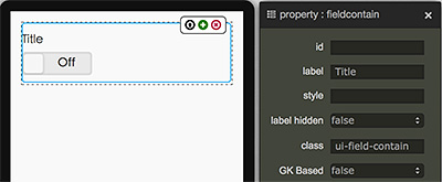
18. flipswitch

Example: http://jqmdesigner.appspot.com/designer.html#&ref=4926207904710656
<div class="ui-field-contain">
  <label for="gk-104rgdq">Title</label>
  <input type="checkbox" data-role="flipswitch" id="gk-104rgdq">
</div>
flipswitch is the commonly seen switch in the Settings on our cell phones. It actually is a variant of the checkbox. You can see in the code that its type is "checkbox." Nevertheless, it has an additional parameter data-role="flipswitch" to make it appear as a switch.
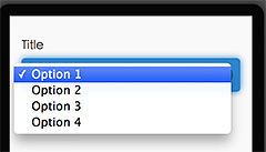
19. selectmenu

Example: http://jqmdesigner.appspot.com/designer.html#&ref=5328381126115328
<div class="ui-field-contain">
  <label for="gk-104mhHQ">Title</label>
  <select id="gk-104mhHQ">
    <option value="option1">Option 1</option>
  </select>
</div>
This component of a pull-down selection menu is actually a combination of select and option. However, you can only add additional choice items by directly adding options.
<div class="ui-field-contain">
  <label for="gk-104mhHQ">Title</label>
  <select id="gk-104mhHQ">
    <option value="option1">Option 1</option>
    <option value="option2">Option 2</option>
    <option value="option3">Option 3</option>
    <option value="option4">Option 4</option>
  </select>
</div>
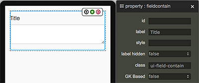
20. textarea-input

Example: http://jqmdesigner.appspot.com/designer.html#&ref=6346022087294976
<div class="ui-field-contain">
  <label for="gk-1043Poc" class>Title</label>
  <textarea id="gk-1043Poc" name></textarea>
</div>
This is a component that allows users to enter multiple lines of text.
21. textarea-input

Example: http://jqmdesigner.appspot.com/designer.html#&ref=6031064753504256
<table data-role="table" data-mode="columntoggle" class="ui-responsive ui-shadow gk-decorate" id="gk-104pqI6" is="jqm-table">
  <thead>
    <tr>
      <th data-priority="1">項目</th>
      <th data-priority="1">Year</th>
      <th data-priority="1">Month</th>
    </tr>
  </thead>
  <tbody>
    <tr>
      <th>1</th>
      <td>2011</td>
      <td>10</td>
    </tr>
    <tr>
      <th>2</th>
      <td>2012</td>
      <td>11</td>
    </tr>
  </tbody>
</table>
This is a table component, but not just a regular one you have seen before. If you look carefully, you will see that there is a button on the upper-right corner. Clicking the button will bring up the option to filter the columns. This is something regular tables cannot do. If you do not need this option, you can simply change the data-mode in the property panel from columntoggle to reflow.

Continue reading Chapter 5 - jQuery Mobile Hidden Components
Or Return to Table of Contents