CHAPTER 4 - jQuery Mobile 元件
介紹 jQuery Mobile 元件 ( 以下簡稱 jqm 元件 ) 之前,一定得先提一下 jQuery Mobile ,jQuery Mobile 是一個 jQuery 的 framework,主要用來創建行動網頁使用,目前的版本是 1.4.5 版,相較於之前的版本,1.4 版開始修正了很多原本的架構,所以速度變快非常多。
如果單純用在開發行動網頁,或是以 web view 為主的 App,jQuery Mobile 是非常的方便好用的一個 framework,EZoApp 原生內建了 jQuery Mobile,也因此 jqm 元件也是必備的,更特別的一點,因為 EZoApp 採用了標準的開發語法,如果內建的元件找不到我們想要的,可以直接上 jQuery Mobile 的官網查詢 ( http://demos.jquerymobile.com/1.4.5/ ) 直接把程式碼貼上就可以產生元件,相當的方便!
這篇開始的連續幾篇,會從 jqm 元件開始,介紹 EZoApp 所有的元件,至少在大家在學會使用元件之後,就已經可以快速開發標準的界面囉!( 之後會有章節介紹如何撰寫 )
EZoApp jqm 元件清單列表 ( 點選看詳細介紹 ) :
1. header

範例:http://jqmdesigner.appspot.com/designer.html#&ref=5010871373791232
<div data-role="header" data-position="fixed">
  <h3>Header</h3>
</div>
這是每個頁面最上方的檔頭,在 App 的設計裡頭主要會放置該頁面的標題,或是左右放上兩顆常用的按鈕的按鈕,若使用 EZoApp,也可以直接點選 header 的文字進行修改,或在屬性面板做相對應的調整。

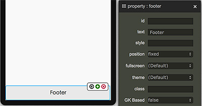
2. footer

範例:http://jqmdesigner.appspot.com/designer.html#&ref=6136771280633856
<div data-role="footer" data-position="fixed">
  <h3>Footer</h3>
</div>
footer 和 header 類似,基本上也是 App 的畫面必備的,也是可以直接點選文字修改,或在屬性面板上坐相對應的調整。
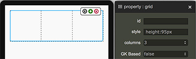
3. Grid

範例:http://jqmdesigner.appspot.com/designer.html#&ref=5941219272163328
<div class="ui-grid-b" style="height:95px">
  <div class="ui-block-a" style="height:100%"></div>
  <div class="ui-block-b" style="height:100%"></div>
  <div class="ui-block-c" style="height:100%"></div>
</div>
jqm 元件最特別的元素,看起來像表格卻又不是表格,純粹利用 div + class 產生類似表格的框架,裡頭比較需要注意的,就是欄位的數量是由 a、b、c、d、e 來定義,外層是 ui-grid-a,表示內含 ui-block-a 和 ui-block-b,外層如果是 ui-grid-d ,就表示內含了 abcde 五個,而最多一列只能有五欄,再多的話就會變成兩欄一列的排列方式。
<div class="ui-grid-d" style="height:95px">
  <div class="ui-block-a" style="height:100%"></div>
  <div class="ui-block-b" style="height:100%"></div>
  <div class="ui-block-c" style="height:100%"></div>
  <div class="ui-block-d" style="height:100%"></div>
  <div class="ui-block-e" style="height:100%"></div>
</div>
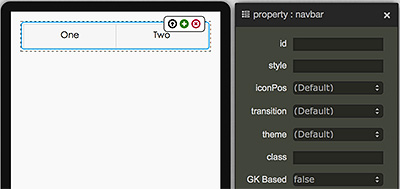
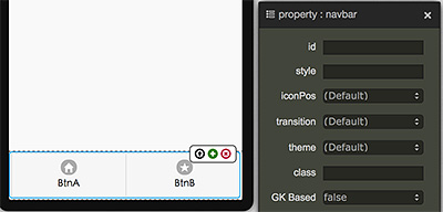
4. navbar

範例:http://jqmdesigner.appspot.com/designer.html#&ref=5993873960599552
<div data-role="navbar">
  <ul>
    <li>
      <a>One</a>
    </li>
    <li>
      <a>Two</a>
    </li>
  </ul>
</div>
App 裡頭常見的按鈕選單,主要由 li 構成,使用 EZoApp 的話同樣可以直接點選編輯文字,或是由屬性面板調控,與 grid 類似的地方,按鈕一列不能超過五個,多的話就會變成兩個一列囉!
5. tabbar
範例:http://jqmdesigner.appspot.com/designer.html#&ref=5573821327212544
<div data-position="fixed" data-role="footer">
  <div data-role="navbar">
    <ul>
      <li>
        <a data-icon="home">BtnA</a>
      </li>
      <li>
        <a data-icon="star">BtnB</a>
      </li>
    </ul>
  </div>
</div>
把 footer 和 navbar 結合的置底選單,這類型的選單在 App 也是屢見不鮮,控制方式也如同 navbar 和 footer 一般。
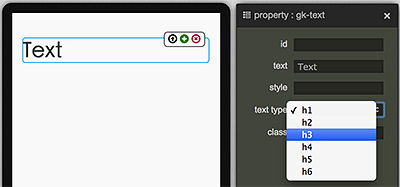
6. gk-text

範例:http://jqmdesigner.appspot.com/designer.html#&ref=6596240439508992
<h1 is="gk-text">Text</h1>
文字的元件,使用 EZoApp 也可以直接藉由點選或屬性面板調整。
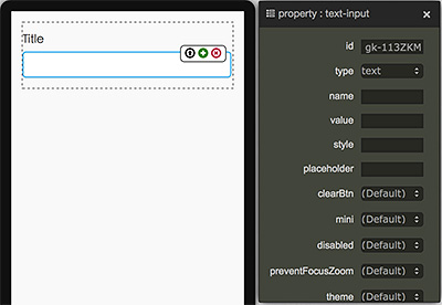
7. text-input

範例:http://jqmdesigner.appspot.com/designer.html#&ref=6025110184001536
<div class="ui-field-contain">
  <label for="gk-113ZKMM">Title</label>
  <input type="text" name id="gk-113ZKMM">
</div>
這只是一個單純的文字輸入框,比較特別的是加上了一些 CSS 的效果,如果不需要外面的 label 的話,直接拿掉 label 也是沒問題的,甚至你也可以用滑鼠直接把輸入框拖拉到外面,而且同時可以利用屬性面板對輸入框做設定,例如把 clearBtn 設為 true,輸入的時候後面就會出現 x 的符號,點選就可以刪除輸入的內容。
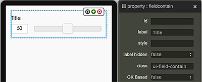
8. range-input

範例:http://jqmdesigner.appspot.com/designer.html#&ref=6604113651433472
<div class="ui-field-contain">
  <label for="gk-1138IX0">Title</label>
  <input id="gk-1138IX0" value="50" min="0" max="100" type="range">
</div>
調整數值的滑動桿,因為在手機或平板的操作上,對於調整數值遠不如電腦上操作來得方便,因此很多時候我們必須使用這種便於調整的元件,而這個 jqm range 元件,你可以直接用屬性面板設定最大值和最小值以及初始值,還可以設定滑動的間隔單位要多少、左側是否要有顏色...等。
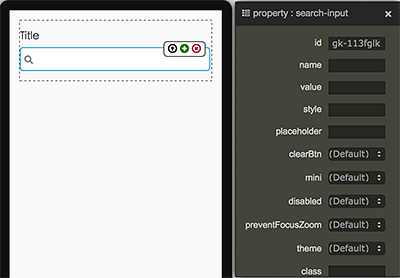
9. search-input

範例:http://jqmdesigner.appspot.com/designer.html#&ref=6519575004839936
<div class="ui-field-contain">
  <label for="gk-113fglk">Title</label>
  <input type="search" name id="gk-113fglk">
</div>
搜尋的輸入欄位,基本上與 text-input 大同小異,差別在於前面多了一個搜尋的 icon,然後程式碼的 type 不是 text 也不是 number 或 password,而是 search。
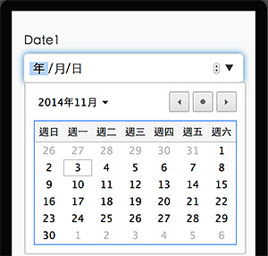
10. date-input

範例:http://jqmdesigner.appspot.com/designer.html#&ref=5285372128919552
<div class="ui-field-contain">
  <label for="gk-113BeiH">Date1</label>
  <input id="gk-113BeiH" type="date">
</div>
日期輸入元件,你千萬不要小看這個元件,不要以為他長得跟上面的 input 很像 ( 不過說實在是真的很像,差別只在 type="date" ) 但如果我們預覽的話,或是用手機預覽,就會發現它是可以直接叫出日曆,或是手機的滾動選擇日曆,相當的方便噢!
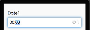
11. time-input

範例:http://jqmdesigner.appspot.com/designer.html#&ref=5462160230580224
<div class="ui-field-contain">
  <label for="gk-113WHfb">Date1</label>
  <input id="gk-113WHfb" type="time">
</div>
與 date-input 相同,可以讓使用者直接調整時間,不需要自己手動輸入的元件。
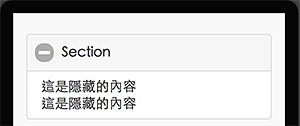
12. collapsibleset

範例:http://jqmdesigner.appspot.com/designer.html#&ref=5430924007178240
<div data-role="collapsibleset">
  <div data-role="collapsible">
    <h3>Section</h3>
    這是隱藏的內容
    這是隱藏的內容
  </div>
</div>
可以把一些內容隱藏起來,點選 + 號可以打開,點選 - 可以收起來。
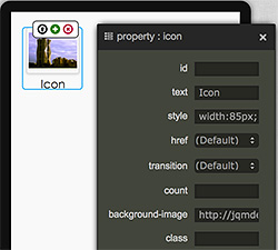
13. icon

範例:http://jqmdesigner.appspot.com/designer.html#&ref=5940879567093760
<div is="icon" style="width:85px; height:90px; position:relative">
  <span class="ui-li-count" style="position:absolute; display:none; z-index:1; right:0; top:6px;"></span>
  <a href="#" class="ui-btn ui-mini ui-corner-all ui-shadow" style="display:block;margin:5px;height:50%;background-image: url(圖片網址); background-size: 95% 80%; background-position: 50% 50%; background-repeat: no-repeat no-repeat;"></a>
  <div style="text-align:center;">Icon</div>
</div>
利用 CSS 背景圖片的方式作出類似 App 裡頭可以點選的圖示。
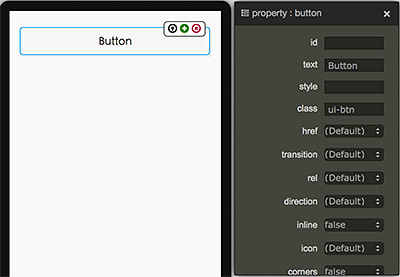
14. button

範例:http://jqmdesigner.appspot.com/designer.html#&ref=5891616426426368
<a class="ui-btn">Button</a>
由程式碼可以看到,按鈕其實就是一個加上了 ui-btn 樣式的超連結,也因為如此,你也可以自己修改樣式,就可以變成客製化的按鈕。
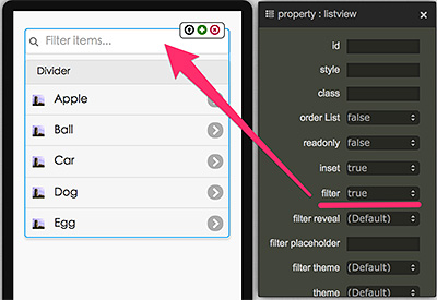
15. listview

範例:http://jqmdesigner.appspot.com/designer.html#&ref=4833352993472512
<ul data-role="listview" data-inset="true">
  <li data-role="list-divider">Divider</li>
  <li>
    <a href="#">
      <img src="清單圖片網址" class="ui-li-icon">Item
    </a>
  </li>
</ul>
jqm 的 listview 元件雖然就是清單,但卻已經幫我們區分好了標題與內容清單,更特別的是,裡頭還提供了篩選 ( filter ) 的功能,如果清單的內容很多,直接在 filter 的搜尋框輸入文字搜尋就可以篩選出特定的內容囉!相當的方便!
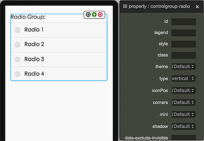
16. controlgroup-radio

範例:http://jqmdesigner.appspot.com/designer.html#&ref=5816401080090624
<fieldset data-role="controlgroup" data-type="vertical">
  <legend>Radio Group:</legend>
  <input id="gk-104dlEd" name="gk-104dlEd" type="radio" data-iconpos="left">
  <label for="gk-104dlEd">Radio</label>
</fieldset>
單選的按鈕,你可以藉由點選按鈕之後右上方出現的 + 號新增,不過新增的時候,name 會自動產生,也因為兩個單選按鈕的 name 不同,會導致無法單選,這時候只需要把 name 改為相同就可以囉!
<fieldset data-role="controlgroup" data-type="vertical">
  <legend>Radio Group:</legend>
  <input id="gk-104dlEd" name="aa" type="radio" data-iconpos="left">
  <label for="gk-104dlEd">Radio1</label>
  <input id="gk-104PBuC" name="aa" type="radio" data-iconpos="left">
  <label for="gk-104PBuC">Radio2</label>
</fieldset>
而身為 jqm 元件的 radio button,一定也會有一些與眾不同的功能,我們可以藉由屬性面板調整 iconPos 就可以控制 radio button 的位置。
而且除了基本的圓圈圈點選外,因為 jqm 元件的誕生目的是為了行動裝置,所以也有提供了比較適合行動裝置的點選方式,我們只要點選外層的 fieldset,並將 type 設為 horizontal,就可以改變 radio button 的呈現方式噢!
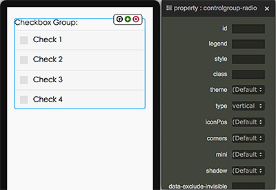
17. controlgroup-checkbox

範例:http://jqmdesigner.appspot.com/designer.html#&ref=4758472788803584
<fieldset data-role="controlgroup" data-type="vertical">
  <legend>Radio Group:</legend>
  <input id="gk-104dlEd" name="aa" type="radio" data-iconpos="left">
  <label for="gk-104dlEd">Radio1</label>
  <input id="gk-104PBuC" name="aa" type="radio" data-iconpos="left">
  <label for="gk-104PBuC">Radio2</label>
</fieldset>
與單選的 radio button 互為兄弟的 checkbox 是負責多選,與 radio button 的設定幾乎一模一樣,也可以點選外層的 fieldset,並將 type 設為 horizontal,就可以改變 checkbox 的呈現方式。
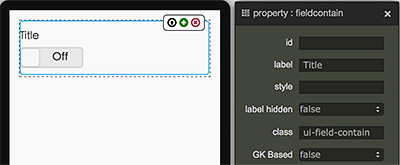
18. flipswitch

範例:http://jqmdesigner.appspot.com/designer.html#&ref=4926207904710656
<div class="ui-field-contain">
  <label for="gk-104rgdq">Title</label>
  <input type="checkbox" data-role="flipswitch" id="gk-104rgdq">
</div>
flipswitch 就是我們在手機「設定」裡頭很常見的開關,其實它也是 checkbox 的一種變形,可以看到程式碼裡頭 type 就是 checkbox,不過裡頭多了一個 data-role=”filpswitch”,所以它就會變成開關的形式呈現。
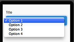
19. selectmenu

範例:http://jqmdesigner.appspot.com/designer.html#&ref=5328381126115328
<div class="ui-field-contain">
  <label for="gk-104mhHQ">Title</label>
  <select id="gk-104mhHQ">
    <option value="option1">Option 1</option>
  </select>
</div>
下拉選擇清單的元件,其實就是 select 和 option 的組合,不過必須要透過直接添加 option 的方式才能增加額外的選項。
<div class="ui-field-contain">
  <label for="gk-104mhHQ">Title</label>
  <select id="gk-104mhHQ">
    <option value="option1">Option 1</option>
    <option value="option2">Option 2</option>
    <option value="option3">Option 3</option>
    <option value="option4">Option 4</option>
  </select>
</div>
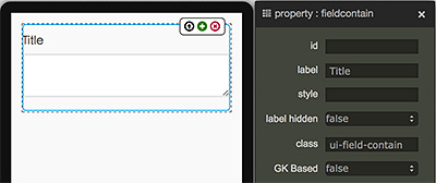
20. textarea-input

範例:http://jqmdesigner.appspot.com/designer.html#&ref=6346022087294976
<div class="ui-field-contain">
  <label for="gk-1043Poc" class>Title</label>
  <textarea id="gk-1043Poc" name></textarea>
</div>
讓使用者可以輸入多行文字的元件。
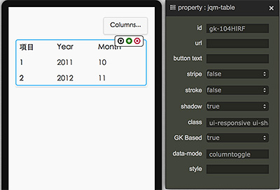
21. textarea-input

範例:http://jqmdesigner.appspot.com/designer.html#&ref=6031064753504256
<table data-role="table" data-mode="columntoggle" class="ui-responsive ui-shadow gk-decorate" id="gk-104pqI6" is="jqm-table">
  <thead>
    <tr>
      <th data-priority="1">項目</th>
      <th data-priority="1">Year</th>
      <th data-priority="1">Month</th>
    </tr>
  </thead>
  <tbody>
    <tr>
      <th>1</th>
      <td>2011</td>
      <td>10</td>
    </tr>
    <tr>
      <th>2</th>
      <td>2012</td>
      <td>11</td>
    </tr>
  </tbody>
</table>
表格元件,不過這不是一個普通的表格元件,如果仔細看,可以發現表格的右上方有一顆按鈕,點選之後會出現篩選欄位的選項,這也是一般的表格所辦不到的,如果不需要,就在屬性面板裡頭把 data-mode 由 columntoggle 改為 Reflow 即可。